

Data Visualization Model for Multi-party Analysis and Strategic Decision-Making in International Trade
Latin-American Journal of Computing, vol. 12, no. 1, pp. 13-26, 2025
Escuela Politécnica Nacional
Received: 28 August 2024
Accepted: 22 October 2024

Abstract: —This paper presents a detailed analysis of Ecuador’s non-oil exports over ten years. The study was performed using the SPEM methodology and data-cleaning processes. The results highlight a notable coherence in analyzing the most relevant export items and the main trading partners, providing essential information for strategic decision-making. Furthermore, recommendations related to the technical conditions necessary to achieve precise and accurate communication through data visualization were considered, and adequate answers to the questions generated in the business knowledge stage contributed to the users’ knowledge. Furthermore, the study suggests incorporating import data to enhance the analysis and provide a foundation for future research in this area.
Keywords: data integrity, multi-party analysis, international trade, strategic decision-making, tableau.
I. Introduction
In the current era, analyzing large volumes of data is crucial for making informed decisions in various sectors, including foreign trade. Data visualization emerges as a powerful tool for converting complex information into understandable graphical representations, allowing patterns, trends, and areas for improvement to be identified.
Sosa [1] highlights the usefulness of data visualization in understanding the evolution of the export sector in countries such as Ecuador, where the economy depends mainly on exporting primary products. This tool allows us to explore changes in export patterns over time, identify the main product categories and destination countries, and evaluate the effectiveness of export policies and strategies.
Traditional analyses of the export sector often focus on a single product or category, limiting the possibility of comprehensive comparisons and evaluations. In conjunction with data mining techniques such as those proposed by Kirk [2], data visualization allows us to overcome these limitations.
The present work proposes a visualization model that uses data visualization and data mining to provide diverse users with convincing, clear, and attractive results. This model is based on cleaning, consolidating, summarizing, and presenting large amounts of Ecuadorian export data using data mining techniques and visualization tools to improve decision-making in the export sector.
This approach is evident in several publications, such as Araque & Arguello [3], Tercero et al. [4], and Tonon Ordóñez et al. [5] who have analyzed cocoa, copper, and banana, respectively. However, this unitary approach uses extensive data visualization tools and data mining and cleaning techniques. The potential benefit of this research is that it simplifies the use of data, aiding end users and businesses to make more informed decisions through enhanced data visualization. With these tools, it is possible to interact with them and extract valuable information without the need to restart from the data preparation phase for each product or item [6], [7]. This can save significant time and effort and allow the user to perform benchmarking and evaluations more efficiently and effectively.
The work methodology is represented by Systems Process Engineering Metamodel 2.0 (SPEM 2.0). The process was performed in four steps: data preprocessing, labeling and inclusion of valuable fields for the analysis, application of the visualization model, and finally, the validation of the model. The items analyses are denominated by the Harmonized System, as recommended in the United Nations Department of Economic and Social Affairs [8] report, since comparability of information between countries is allowed.
This article is structured as follows: Section II contains the related works that influenced this research. Section III describes the methodology and theoretical framework used in this research. Then, Section IV presents the results that were obtained in the study. Likewise, Section V presents the discussions regarding similar works and our contribution, and finally, Section VI presents the conclusions of this research.
II. Related work
Throughout history, many people have contributed to the development of data visualization. Thus, some of the pioneers in data analysis are presented, such as William Playfair, who was the first to use graphs to represent economic data, contributing to the popularization of bar, line, and sector graphs [9]. In the 1850s, Florence Nightingale (1820-1910) shared her professional vision as a nurse using data visualization techniques to show the importance of sanitary conditions in the care of soldiers during the Crimean War [10]. At the end of the 19th century, Karl Pearson (1857-1936) introduced the concept of correlation coefficient, which measures the relationship between two variables. Pearson also pioneered statistical techniques in genetics and created the chi-square test [11]. Ronald Fisher (1890-1962) is the father of modern statistics. In the 1920s, Fisher developed statistical techniques for data analysis in genetics and biology and was one of the first to use the maximum likelihood method to estimate parameters [12]. John Tukey (1915-2000) was one of the first to use data visualization for exploratory analysis, creating techniques such as the box-and-whisker plot and the matrix scatterplot [13]. Another pioneer was Jaque Bertin (1918-2010), who, using computers, produced the publication Semiologie Graphique, which showed the link between data and its visual function, the science of graphical representation of data, and the basis for visual data analysis [12].
Concerning the visualization of foreign trade data, there are interpretations from several decades ago, focusing on the graphical representation of economic data through graphs and maps, such as “The Atlas of United States Exports,” published by the United States Department of Commerce. A wide range of data on United States exports was presented as maps, graphs, and tables with that Atlas. The data were presented by country and sector, which allows the identification of foreign trade trends and patterns. Another graphical representation is “Comtrade Data Visualization”, an international trade database managed by the United Nations. This data visualization tool allows users to explore global trade by country and product. The visualization uses interactive charts and maps to show trade trends and exchange patterns [8]. Finally, TradeMap is a data visualization tool developed by the European Commission that allows users to explore international trade between the European Union and other countries. The tool uses interactive graphs, charts, and maps to show trading trends and patterns [14]. These findings underscore the importance of data visualization as a fundamental component in understanding trade data.
Over the past years, we have witnessed a transformative leap in data visualization technology. This leap has allowed the development of more sophisticated and practical data analysis and interpretation tools, expanding new horizons for researchers and professionals [15]. Data visualization tools are not just about visual appeal but practicality and functionality. They allow exploration in different dimensions and the visualization of complex patterns and relationships that would be difficult to detect otherwise. Several studies, such as that by Skender & Manevska [16], note in their review that various tools exist for visualization and visual data analysis. New techniques and approaches, such as K-means cluster, Gravity Equation, and 3D data visualization, have practical applications in analyzing trade and economic data [17]. These new options have allowed greater flexibility and creativity in data presentation and analysis [18] and led to valuable insights and recommendations.
Regarding data visualization research, there is a plethora of scientific literature available in the field, including theoretical, applied, and evaluation studies of visualization tools. Durán, J. & Zaclicever, D. [18] used the grouping of countries by region with trade agreements: Andean Community of Nations (CAN), Caribbean Community (CARICOM), Southern Common Market (MERCOSUR), Central American Common Market (CACM) and analyzed the amounts of regional exports. In the study by Tercero et al. [4], copper trade flows between countries were examined, generating representations on maps and direction arrows, where the thickness of the lines was used to identify the transaction amounts and the grouping of countries by region, which quickly detected the movement between origin and destination.
In the work of Morrison et al. [14], the health of a country’s economy was measured based on the number of exported items; they analyzed the complexity of the products produced and described complex economic systems with networks connected by points whose central location denotes importance. The non-linear iterative evaluation of complexity was described as a specialized process and very susceptible to the variation in the number of games studied and data cleaning. Finally, the recommendation does not analyze tariff items at a four-digit level but at six for greater detail. Straka et al. [19] obtained an algorithm that allows for the measurement of the similarities between export products and the level of technological advance of the countries through the bipartite representation of the International Trade network, using the calculation of the entropy and projective models. They exported information from 1995 to 2010, identifying country communities with color keys on a world map and analyzing specific sections of years to validate their estimates. Dong et al. [20] studied global wheat consumption, verifying the influence of climate patterns in each region studied. The information came from the United Nations database, and they segmented the countries as protagonists and peripherals concerning world trade. They used bar graphs, choropleth maps, and line graphs. They recommended studying the other variables not considered, such as oil price, water availability, and socio-political conditions.
Dar et al. [21] made visualizations and an estimate of the commercial profile of the South Korean economy based on the growth that its products have in the world market to serve as a guide in the policies and business decisions made by the government. They found a positive evolution in their trade relationship with other Asian countries. They recommended viewing the country’s trade profile for a greater understanding of trade, as it can provide detailed and easily accessible information, which allows precise estimates to be made. In the context of analyzing bilateral trade data involving more than two hundred countries, together with China, Ye et al. [23] proposed a geospatial analysis methodology known as the Digital Trade Feature Map (DTFM). This methodology offers a broad and detailed vision for analyzing the characteristics of specific products and their relationships with other products. The authors used the import and export values in Cartesian coordinates to implement this approach. Then, they calculated the differences between these values and plotted them as a line on a Cartesian plane. Subsequently, they evaluated the volume of commercial exchange and its range-size distribution based on the criterion of transaction amount versus frequency. In this way, they identified rare or high-trade products located at the top of the distribution and low-trade or repetitive products at the bottom. The authors concluded that the DTFM method is a valuable tool for analyzing trade trends, especially when information on imports and exports is available. This approach is a fundamental preliminary step before the statistical data analysis, providing a solid and meaningful perspective. Qaiser et al. [22] measured South Korea’s economic complexity index, using time series to identify patterns and make trade estimates. They considered that the visualization and forecasting of imports, exports, Gross Domestic Product (GDP), and GDP per capita benefit international trade. The analysis, visualization, and forecasting of global trade must be determined in an increasingly detailed and precise manner. They managed to identify the main trading partners and make estimates of the country’s imports and exports, establishing a positive correlation with GDP and GDP per capita. In other studies, such as that of Kim et al. [23], considering several fundamental aspects when designing data visualizations is essential. This includes knowing the type of user, the specific objectives of the visualization, and the size of the device on which the information is presented so that the appropriate tools are used to display the content without distortion, avoid loss of meaning, and optimize the user's interaction experience. For this purpose, they validated 378 pairs of visualizations from various sources and data. They defined 76 characterizations that align with the specific objectives sought with visualization to satisfy the users’ needs and expectations.
According to Wu et al. [26], the world economy is becoming more interconnected, and there is a growing need to understand industry trends better. For this reason, Wu et al. introduced VIEA, a web-based system with various views and interactive features. VIEA lets us know the critical economic trends, where those issues are produced, trade patterns, and the economic comparison between industries. Medina López et al. [17] studied about Ecuadorian exports to create a knowledge base for trade specialists. To achieve this, a data visualization tool examines data from 2008 to 2018. The well-established CRoss Industry Standard Process for Data Mining (CRISP-DM) method for data mining projects was used as a foundation. This method involves five steps adapted to develop the mining and visualization model. The result is an interactive tool that allows users to explore key trade variables for Ecuador. This user-friendly interface makes it easier to analyze exports and ultimately supports informed decision-making in foreign trade.
According to Ren, D. [24], the Tableau Desktop software was recognized as configurable in the form of shelves due to its referent types of representations that obey the creation of different internal rules of the program and allow the combination of several attributes on the same screen. It has multiple representations for the measurements and dimensions of the data. It was also indicated that the flexibility for creating graphs is limited by the control at a high level of granularity of the data and the need for more options to combine different screens.
III. Materials and Methods
In the methodological process, the SPEM 2.0 approach methodology effectively represented each stage of the data analysis process. The methodology was divided into four consecutive steps, as shown in Fig. 1.
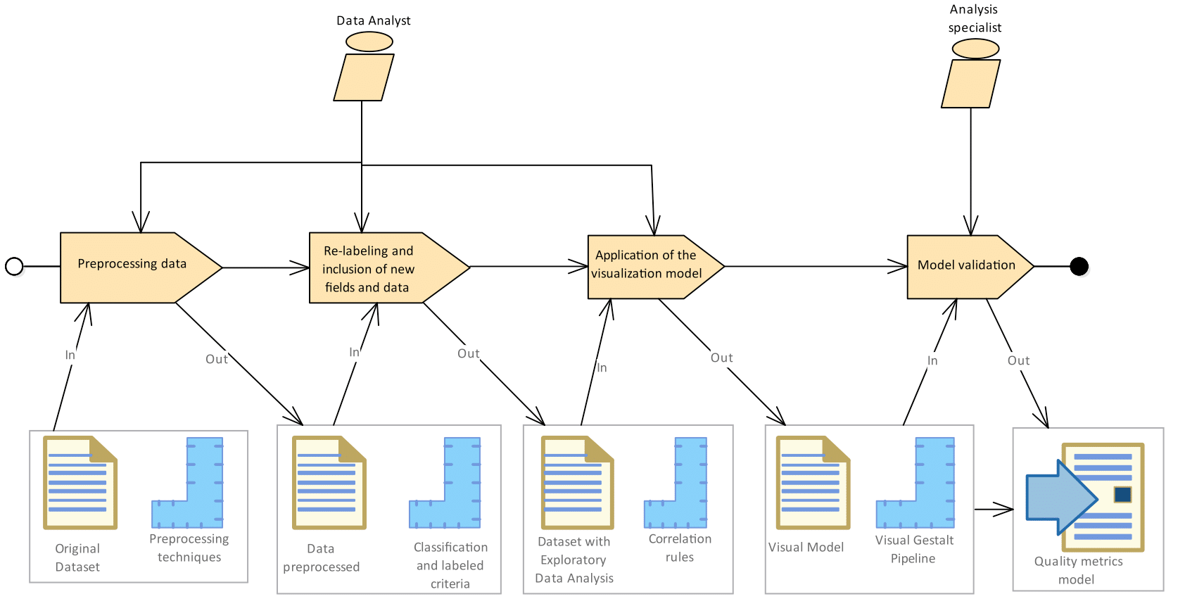
Thus, according to Fig. 1, the execution responsibilities are established in different methodology stages: the data analyst is responsible for the execution from steps 1 to 3, and the analysis specialist is accountable for the last step. The dataset of this study is obtained from the Central Bank of Ecuador, corresponding to the annualized export records performed between 2008 and 2018.
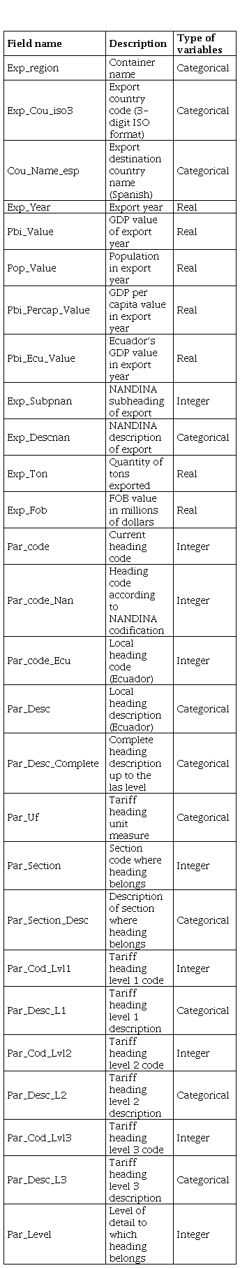
This data added the name of the receiving country, the International Organization for Standardization (ISO) Code, and values exported as Free on Board (FOB) and Metric Tons (MT). Computer Science Research & Development Laboratory (LIDI) researchers preprocessed the data set provided at the University of Azuay. These researchers included columns with information on Population GDP, GDP per capita [25], distance to Ecuador from other countries, and force of attraction [17], [26].
The columns of the dataset have the following characteristics.
A. Data preprocessing
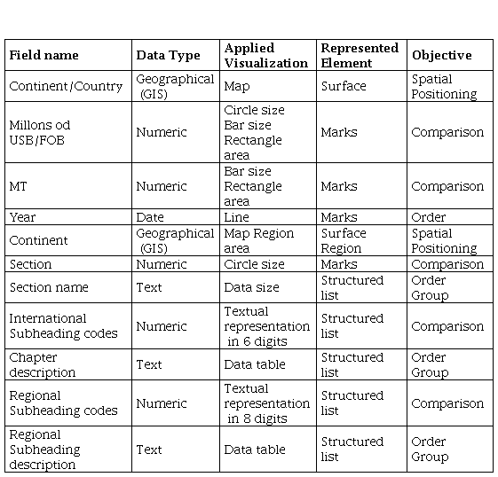
In this initial phase, cleaning and transformation tasks were performed on the original data set in Comma Separated Values (CSV) format to ensure quality and consistency. This included standardizing formats and correcting missing data. The process started with identifying the data types present in the initial set, including specific data types. A detailed description of each type can be found in Table I.
This step was performed with the Tableau Prep Builder tool; the changes applied sought to adjust to the requirements of the data analyst and the program that was subsequently used in the visualization stage [27]. The pre-processing stages were i) renaming headers and cleaning fields, ii) changing the type of fields, iii) cleaning and trimming fields, and iv) filling empty fields.
B. Re-labeling and inclusion of new fields and data
At this stage, Tableau Desktop was used to load and prepare the data for visualization. Previous adjustments were made, including the geographic coordinates of the four countries mentioned in Table II. This table details countries whose location was not automatically recognized by the software and was manually populated with relevant geographic information.
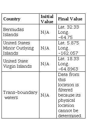
It is essential to clarify that we applied a filter to exclude data corresponding to the location of international waters or Transboundary waters during the initial data load. This decision was based on the challenge of pinpointing a fixed geographical point for its representation on the map. Additionally, crucial information such as population, GDP, and other valuable data were unavailable for this location visualization.
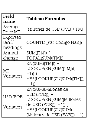
Table III details the calculation formulas used to create additional fields, such as the Average Price, MT, and the Number of Items. These formulas allowed us to answer critical questions through descriptive statistical analysis, such as: How much does each country sell? What products are sold? With which country are the most transactions performed?
Additionally, given that the analysis focused on Ecuador’s nonoil exports, answers were sought to the following questions: How much does each country buy? What products does it buy? With which country are most transactions performed? These questions are aligned with the recommendations of the World Trade Organization in its publication “A Practical Guide to Trade Policy Analysis".
C. Application of the visualization model
In this stage, the visualization model was designed to represent the data in an understandable and compelling format based on Gestalt visualization principles, establishing an appropriate pipeline (route) [28]. Various visualization techniques, such as graphs, charts, and interactive dashboards, were used to communicate the patterns and trends identified in the data [29]. Thus, the available data were considered as viewable.
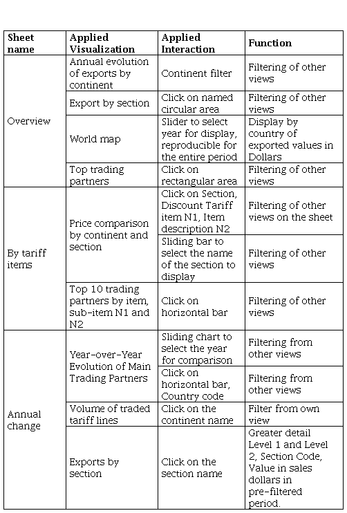
As we can observe, Table IV details the fields and elements represented in the visualization, detailing the purpose pursued by each view.
1) Interactions
The interactions added to the visualization aim to facilitate the users’ journey through the designed environment. Table V specifies the interactions included in the representation and their usefulness for the user, considering the visualization principles.
D. Model validation
The expert on the subject verified the results shown by the applied model provided, and adequate answers to the questions generated in the business knowledge stage contributed to the users’ knowledge. For that, Munzner [10] considers four levels of validation:
The subsections detailed below are the types of validation necessary to apply during testing a visualization model, preferably during user interviews so that it contributes to the area of knowledge.
1) Data abstraction
In this context, the need to evaluate the listed approaches is emphasized, which helps to improve clarity and effectiveness in data management in analysis and presentation.
Compare with existing reports.
Have an alternative scenario.
Evaluate other visualizations
Check simplicity.
The subsections detailed below are the types of validation necessary to apply during testing a visualization model, preferably during user interviews so that it contributes to the area of knowledge.
2) Visual coding, functional interactions
These three elements combine to improve the user experience in exploring and understanding data through a visual interface.
Validate manipulability
Interaction validity
Validity response to actions
3) Algorithmics Implementation
It ensures that operations and algorithms are efficient and fast in providing results in real time or with acceptable response times. They ensured that the software complies with usage licenses and that visualizations were available for seamless integration into the workflow. This is essential to maintain effectiveness in implementing data processing and visualization systems. Thus, these aspects are fundamental to guarantee efficient and legal operation in algorithm and data management.
Validate response speed (Software or own code).
Validate access to licenses and views.
IV. Results
Following the research objectives, the results of the data analysis process are presented. The development was performed with Tableau software, which provides significant details in visual analysis.
A. Prepared dataset to be analyzed with tools display
Each variable was analyzed in case of missing data to prepare the dataset and reach a correct analysis. Depending on the data type, different methods were used to clean the data to reduce the noise and inconsistencies found in the dataset. The number of records prepared for the analysis in Tableau was 318,629.
B. Model visualization of the export evolution
Based on the data prepared for Tableau software, it includes the graphs corresponding to the inter-annual variation of export amounts of Ecuador in millions of dollars and tons between 2008 and 2018 in non-oil items. As we can observe in Fig. 2, the most representative years in positive variation from the point of view of the tons exported were 2011 and 2014, having their counterpart in the years 2010 and 2012 in terms of millions of dollars/FOB. The years with the most significant positive variation were 2010, 2011, and 2014. However, the years that represented negative percentages were 2009, 2015, and 2016.
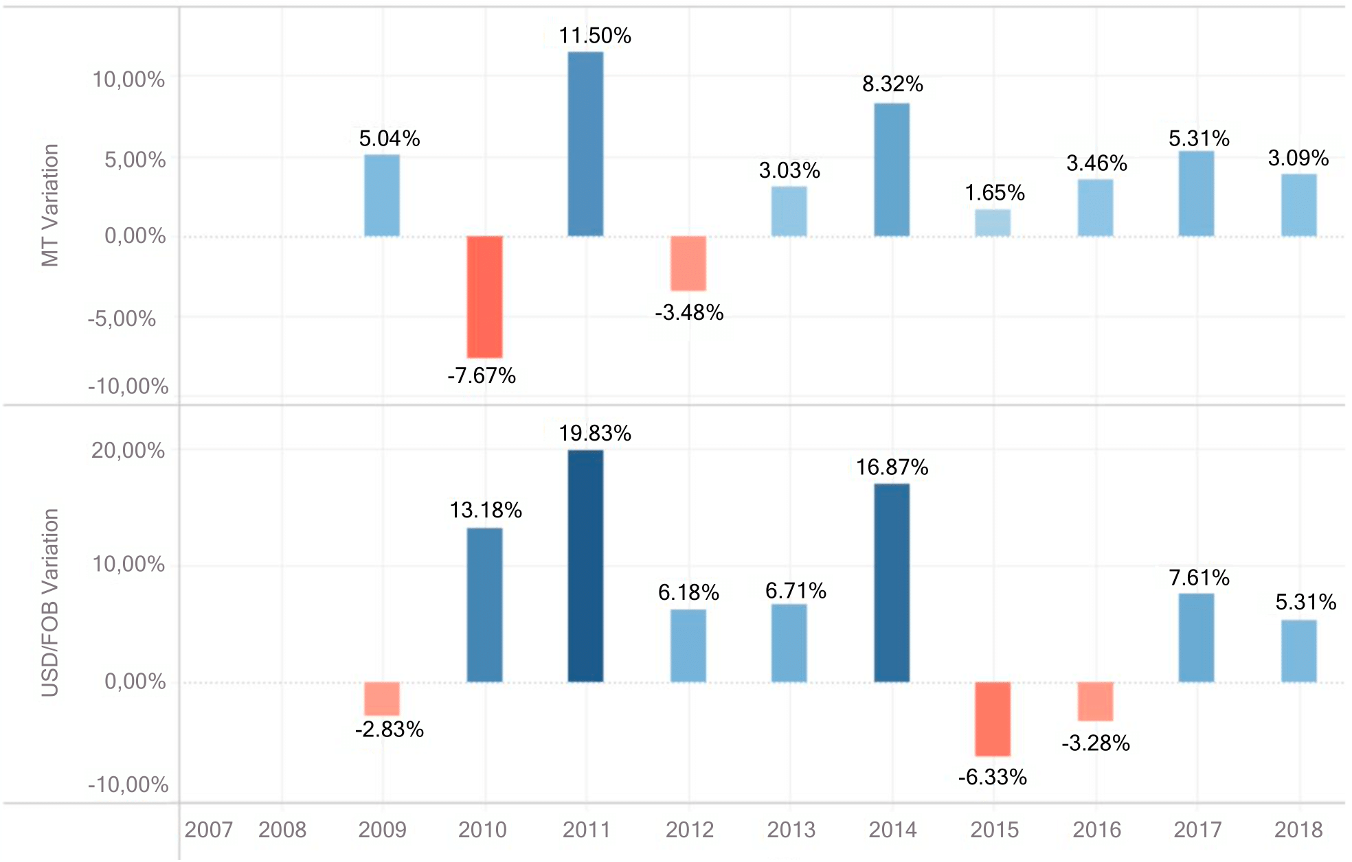
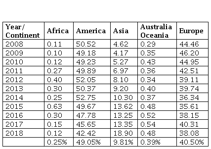
Table VI contains information on the percentage of annual participation of each continent in total non-oil exports between 2008 and 2018. America has had the highest average percent participation throughout the years. Years show a decreasing trend from 50.52 % to 42.72%.
Over the same period, Europe has shown a significant level of participation, albeit with a decreasing trend. This is particularly noticeable as it transitions from 44.46% in 2008 to 38.08% in 2018. In other words, it has been a region of accelerated growth since 2012, increasing its share from 8.10 % to 18.90 % of the total amount exported in millions of dollars/FOB for 2018.
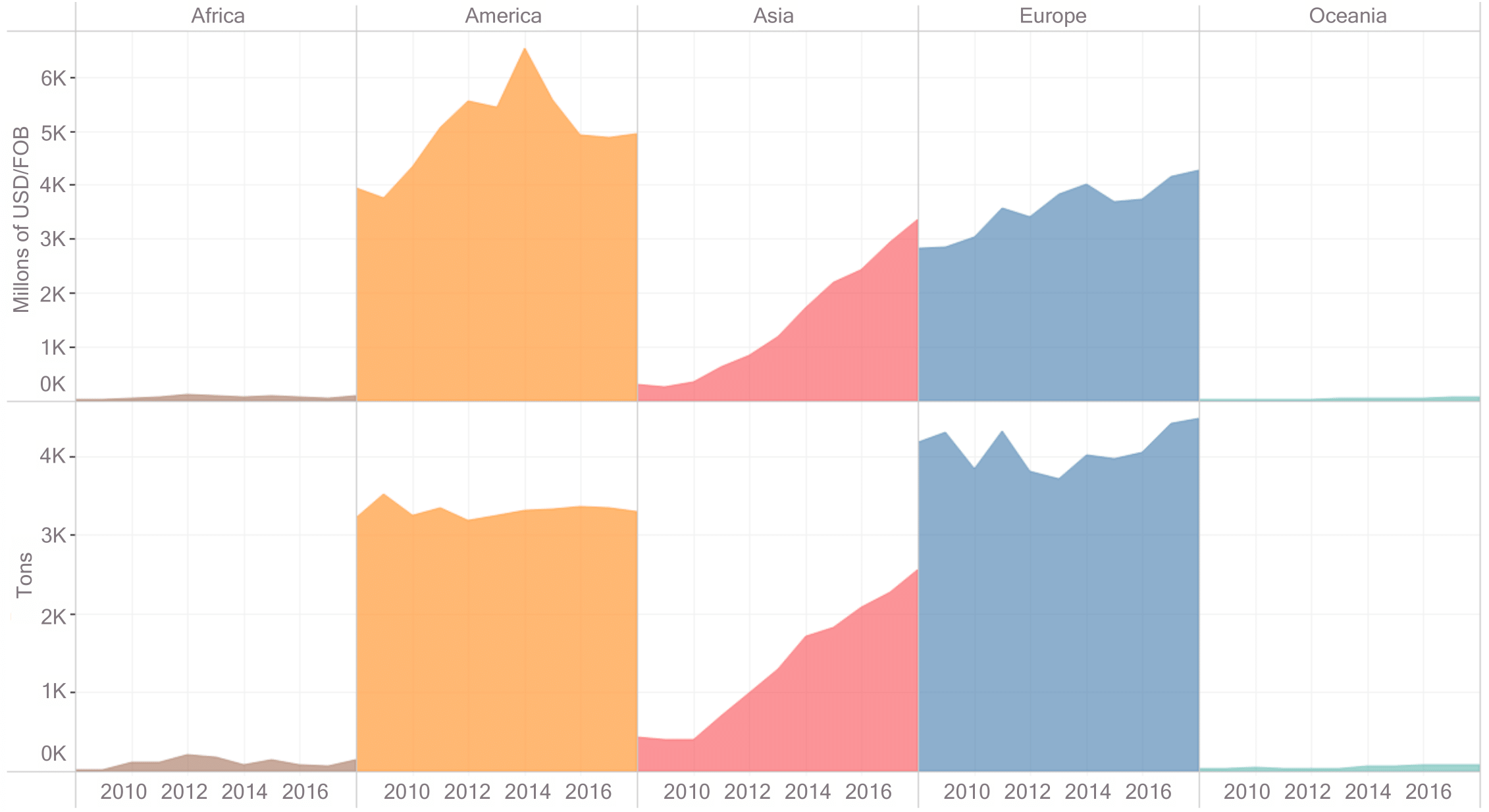
We can see in Fig. 3 that from 2008 to 2018, in exports to the five continents, America appears as the largest trading partner in terms of USD/FOB; in second place is Europe. Then there is Asia, while polygons with a smaller area represent the trade exchange with Africa and Oceania.
Suppose the same analysis is performed in terms of tons. In that case, Europe is the commercial destination with the most significant participation, followed by America and Asia, which shows growth, based on the graph drawn as areas in this historical record. The cumulative development of exports to the different continents, particularly in America, Europe, and Asia, is a promising sign for the global market. Commercial transactions with Africa and Oceania, on the other hand, are negligible.
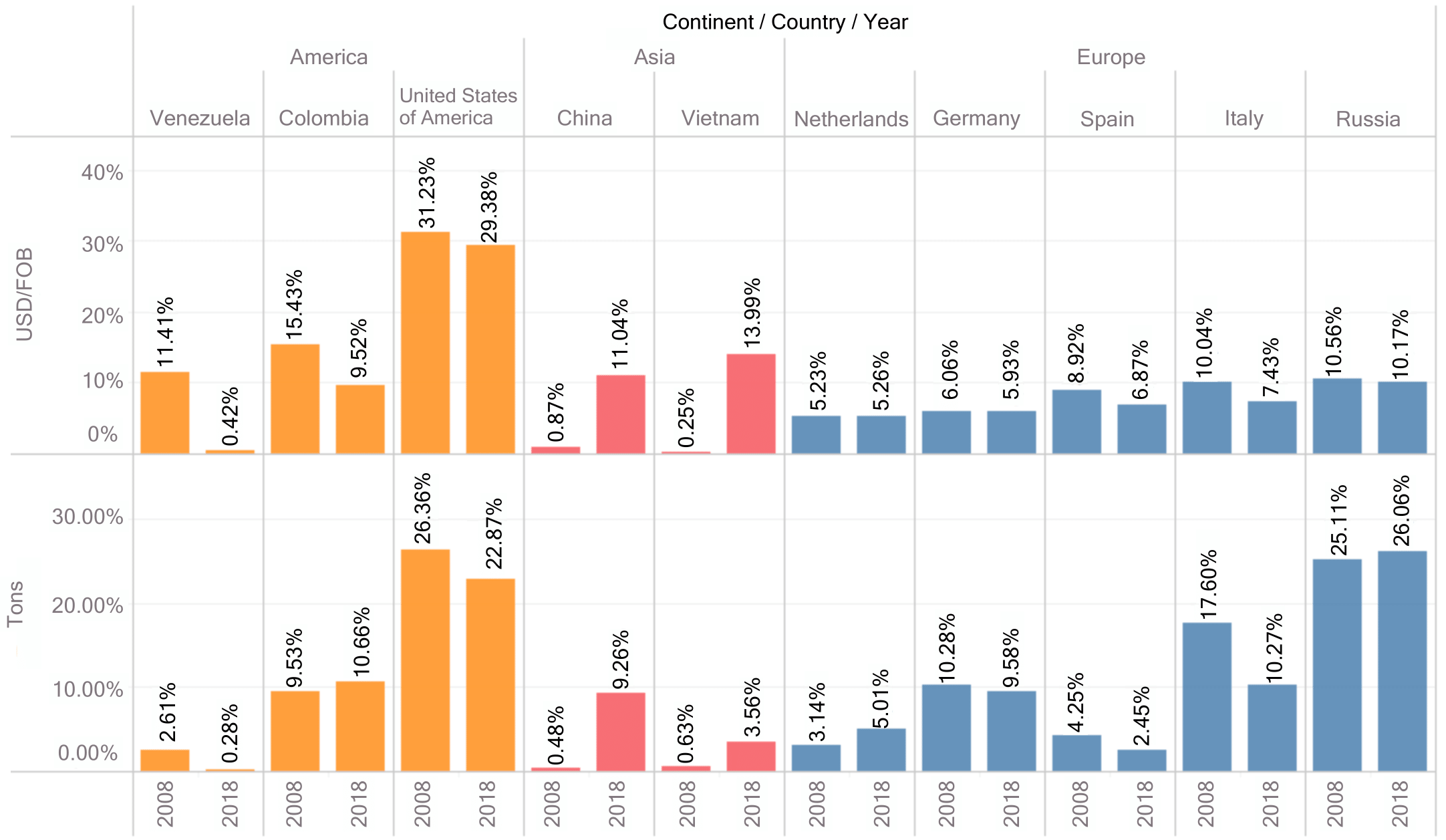
America has a 49.21% participation in purchases in dollars, Europe occupies the second place with 35.23%, while with the reference Tons, Europe occupies the first place with 46.06 %, and America participates with 37.19 %. It can be understood that the countries located within these continents, including Ecuador, made the most outstanding exports in the period analyzed. Another critical analysis focused on the main trading partners, where the accumulated purchase amount of millions of USD/FOB and tons is analyzed between 2008 and 2018. The analysis highlights the participation in the purchases of the ten main trading partners of Ecuador, which in the Americas are the United States, Colombia, and Venezuela, while in Europe, Russia, Italy, Germany, the Netherlands, and Spain emerged, and finally in Asia, China, and Vietnam. As can be observed in Fig. 4, the geographical location of Ecuador’s main trading partners is shown, where the size of the circle is the amount in millions of USD/FOB of exports made in 2018.
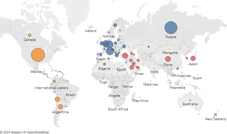
Fig. 5 indicates the percentage of participation in Ecuador’s exports from 2008 and 2018 of the ten main trading partners, finding that the United States has a decrease both in millions of dollars since it changes from 31.23% to 29.38% and in tons, which ranges from 26.36% in 2008 to 22.87% in 2018. This decrease in percentage participation contrasts with what happens with countries on the Asian continent, where China and Vietnam have grown significantly. The first country goes from 0,87 % to 11.04 % and the second from 0.25 % to 13.99 % in millions of dollars; with this in the last year analyzed, they are already part of Ecuador’s ten main commercial partners. Concerning Europe, the percentage variation in participation in total exports could be more notable, except for Italy and Spain, which shows a downward trend.
The most exported products were detailed by ordering from the highest to the smallest sum of the accumulated purchase in terms of millions USD/FOB from 2008 to 2018, without applying country or item filters.
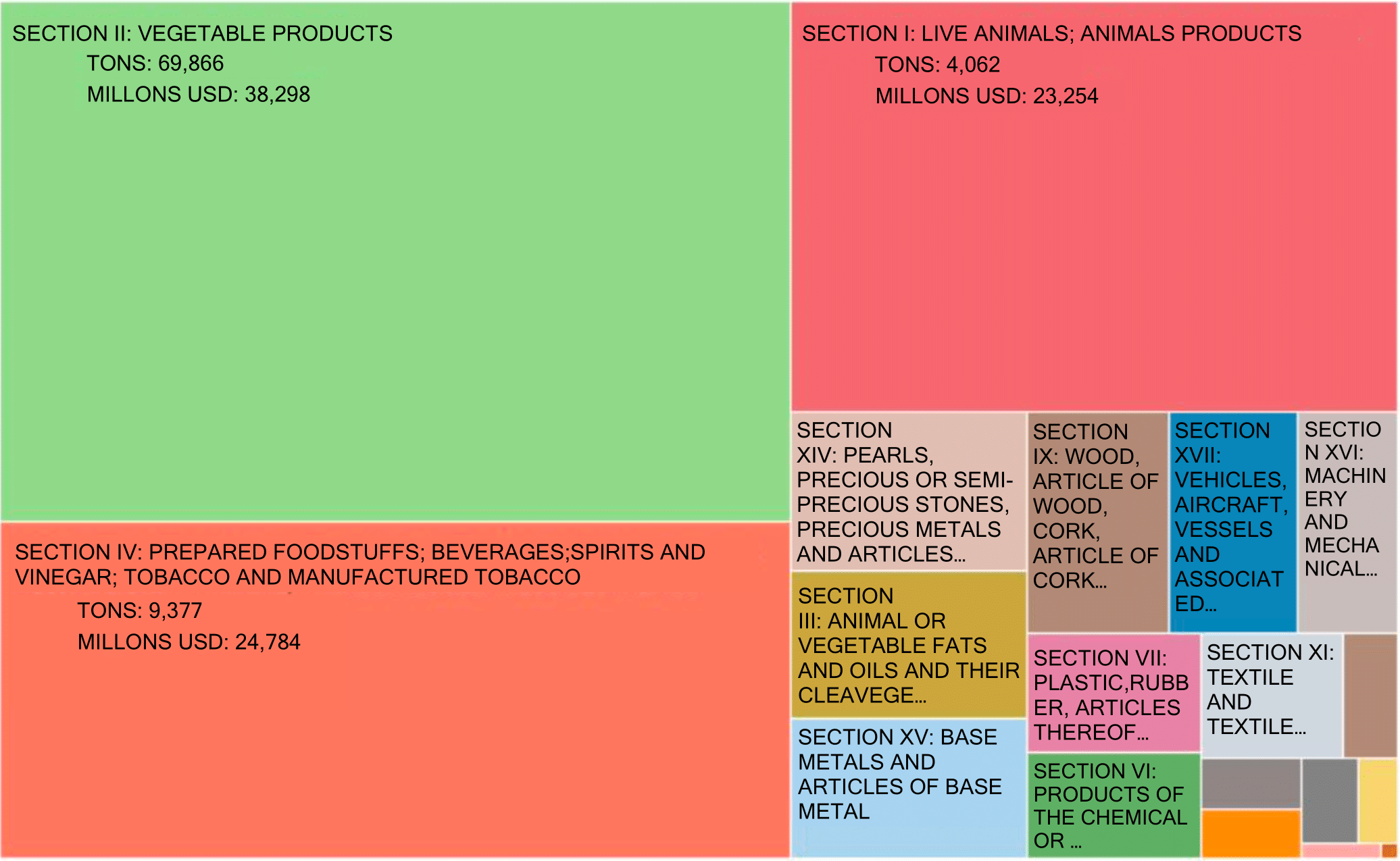
The most crucial section within exports is not Ecuadorian oil companies, but rather those products composed of the plant kingdom, followed by products from the food industries such as alcoholic liquids, vinegar, tobacco substitutes, beverages, tobacco, and tobacco manufacturers. In contrast, the smaller products are weapons, ammunition, and their parts and accessories.
Using a TreeMap in Fig. 6, the sections can be identified as most representative of the exports made by Ecuador. The amounts in millions of Dollars and tons are described in the same view, and a significant color code has been created for the rectangles, which can be associated with the data they represent.
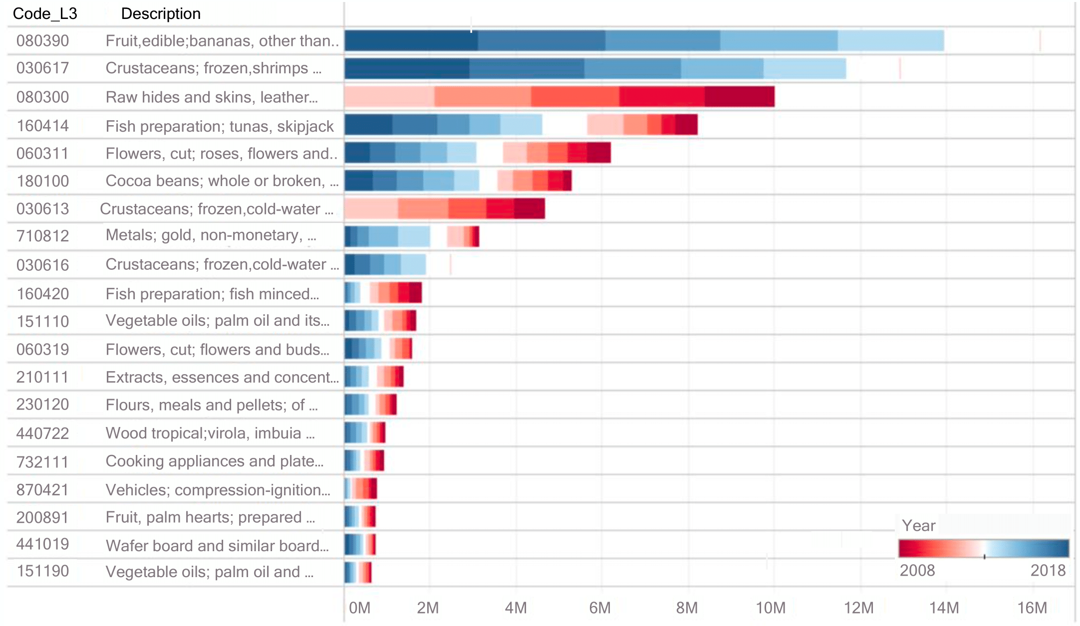
These are those tariff headings identified with a 6-digit coding, which come from the sections evidenced in the previous section and whose accumulated export amount in terms of Millions of USD/FOB between the years studied, placing them as the 15 most representative. In Fig. 7, we can note that code 080390 (“Edible fruits and nuts; citrus peels, melons or watermelons”) comes to first place in the list, constituting 22% of the total, followed by 030617 (“Fish and crustaceans, mollusks, and other aquatic invertebrates”) with 16% by weight, referring to the same amount.
The abstraction of the information is facilitated by using a bar graph in Fig. 7, which also provides a legend that includes color coding by years (recent blue, previous red). The existence of items that have not been traded in recent years can be noticed. Also, the total export amount is represented by the height of the bar.
With the previously analyzed data, the need to develop a model of visualization of export data emerges, allowing the study of non-oil items marketed by Ecuador between 2008 and 2018. Figs. 8, 9, and 10 are included, where the analysis of one continent at a time is proposed to test the capacity of the model to provide the required information in consolidated views. Fig. 8 consolidates in quadrant I: the variation in importance in exports in Millions of USD/FOB and TM between 2008 and 2018 for the countries that belong to the American continent and are part of the top 10 partners. In quadrant II, the evolution of values exported throughout the period is evident in Ecuador’s commercial sectors. Quadrant III shows the geographical location of each of the countries to which exports have been made, characterizing with the size of the circles the amount of their transactions in terms of Millions of USD/FOB. Finally, in quadrant IV, a tree graph identifies the sections and the number of exports in that year in Millions of USD/FOB and Tons.
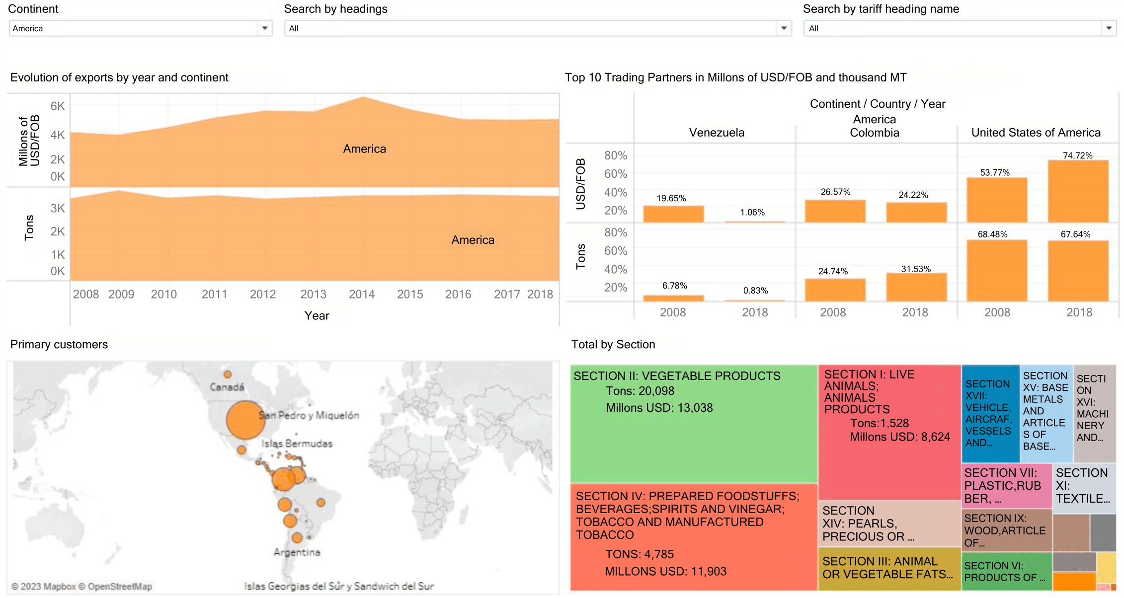
Fig. 9 shows that when the name of the Vegetable Kingdom Products section is used as a filter and the continent filter, such as America, is kept active, the 6-digit codes of the most relevant items in quadrant I are displayed. Exports: The color legend allows us to identify the years they were exported. In quadrant II, the list of countries identified as the largest trading partners of that continent is shown; in quadrant III, the total amount exported both in Millions of USD/FOB and MT is provided, and finally, in quadrant IV, the variation in exports of the included items is illustrated and validated year after year.
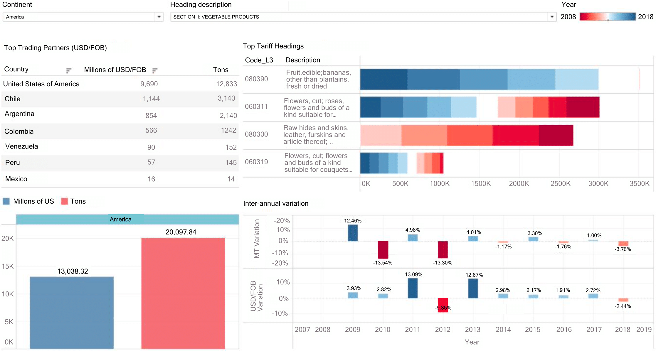
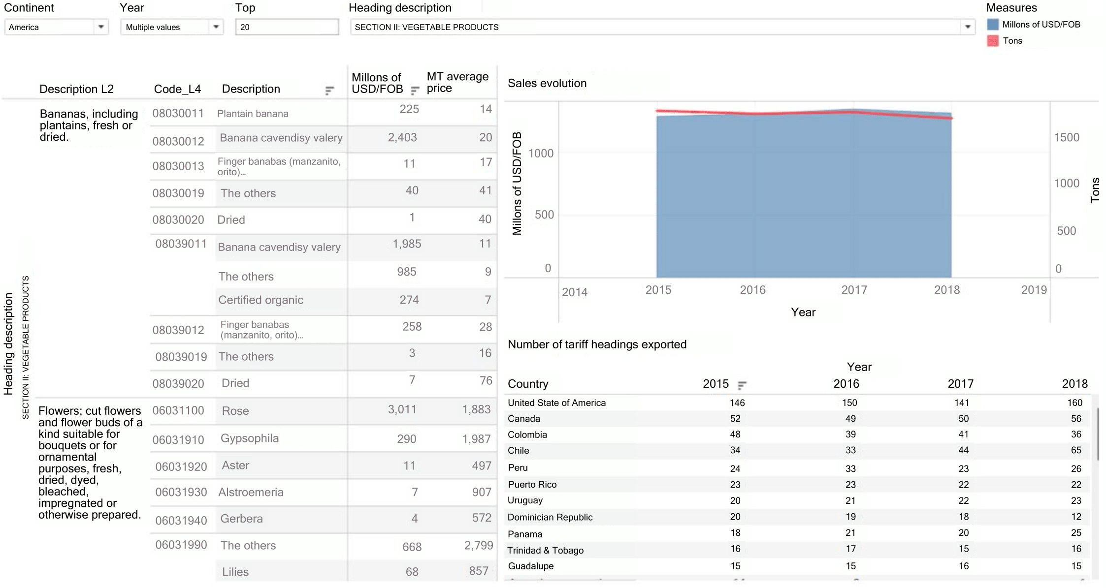
Fig. 10 contains more significant details about the items corresponding to the Products of the Vegetable Kingdom section. 2015 to 2018 have been selected as a filter for this example. In quadrant I, we find a double-axis graph with an area diagram for the amount in Millions of USD/FOB and a line graph as the second axis, with the value of MT exported in the filtered period. Quadrants II and III contain the list of items that integrate the most representative item of exports in the section with a calculation of the average price per item, and in quadrant IV, a table with the number of items that were exported to each country on the chosen continent.
Through the visualizations shown above, it can be observed that the selection of appropriate graphic elements provides the user with a better assimilation of information. Also, it reduces the time and effort required to obtain conclusions. It gives the user a comprehensive vision of the topic by going from a macro level to reaching specific details, with fewer steps than conventional systems or programs, highlighting the prior data treatment with mining techniques. Choosing appropriate graphical representations can become a competitive advantage when making decisions—actions or decisions with data disposal.
V. Discussion
The research findings are aligned with the existing literature on main exports between 2016 and 2018 in Ecuador, as per the United Nations United Nations Department of Economic and Social Affairs [8] 4-digit tariff classification and main partner continents, offering a fresh perspective on the subject.
Through the results of this study, we approve the analysis of Durán, J. & Zaclicever, D. [18] on the commercial relationship with Colombia in textile materials and their manufacturers, further validating their findings.
Similarly, the publication of Casanova et al. [30] on the tariff items exported to China between 2008 and 2014 further supports our observations. Likewise, the most frequent destinations for Ecuadorian products mentioned in [31] and [5] concur with those determined by analyzing the export data from this research.
Hence, this study focuses solely on the values of Ecuadorian exports without calculating trade balance balances. Additionally, the analysis is limited to Ecuador and its trading partners and does not include the items in Section V of Ecuador’s National Tariff corresponding to Mineral Products.
Therefore, the results of this research agree with the existing literature on Ecuador’s main exports, such as the commercial relationship with Colombia in textile materials and the frequent destinations of Ecuadorian products. Data preparation, exploratory analysis, and visualization were performed using good practices recommended in the literature. The study is limited to Ecuadorian exports and does not include an analysis between countries or the Mineral Products categories.
VI. Conclusions
Records of Ecuador’s export transactions constitute a competitive advantage for users who must make decisions. Therefore, a comprehensive review of the literature and available data sources on export data visualization was conducted. Additionally, academic studies and industry reports were identified that highlight the usefulness of this tool for exploring and understanding data.
The information provided by LIDI and the Central Bank of Ecuador was divided into a central "facts" table and peripheral "dimension" tables (star model) to improve efficiency and facilitate accurate queries. Thus, dashboards with graphs, tables, maps, and other visualizations were prepared to validate the results. These were socialized with interested parties, who evaluated the ability of the model to respond accurately and adjust to reality. The results were compared with existing studies, and satisfactory answers were obtained.
Due to the need for more data visualization in specific areas such as population, GDP, and distance between countries due to its low relevance, it can be included in future research, such as expanding the scope of the analysis and considering other relevant variables.
References
[1] M. Sosa Arencibia, “Mercado internacional del cacao: una referencia obligada para la inserción del cacao de Baracoa,” Revista Cubana de Información en Ciencias de la Salud, 2018.
[2] A. Kirk, Data Visualization: a successful design process. Packt publishing LTD, 2012.
[3] W. Araque and A. Arguello, “Cacao Ecuatoriano, una Fuente de Oportunidades de Negocio para Emprendedores y Pyme Exportadoras,” Observatorio PyME - Universidad Andina Simón Bolivar, vol. 20, 2014.
[4] L. A. Tercero Espinoza, M. Soulier, and S. Haag, “Visualizing global trade flows of copper: An examination of copper contained in international trade flows in 2014,” 2016.
[5] L. Tonon Ordóñez, J. Vásquez Bernal, A. Armijos Orellana, and J. Altamirano Flores, “Análisis de las exportaciones ecuatorianas por medio del modelo de gravedad. Caso banano: Ecuadorian exports analysis through a gravity model approach. Banana case,” REVISTA CIENTÍFICA ECOCIENCIA, vol. 9, no. 4, pp. 77–110, 2022.
[6] S. I. Goyzueta Rivera, “Big Data marketing: una aproximación,” Revista Perspectivas, no. 35, pp. 147–158, 2015.
[7] M. Suárez-Castro, Y. Vega-Sampayo, E. Olivero-Vega, and A. Jiménez-Chávez, “Análisis en el comportamiento de las exportaciones colombianas hacia China desde el 2013 hasta el 2018,” e innovación, 2020.
[8] United Nations Department of Economic and S. Affairs, International Trade Statistics Yearbook 2019, Volume II. United Nations, 2021. [Online]. Available: https://www.un-ilibrary.org/content/books/9789210054799
[9] Iniciativa Aporta, “Visualización de datos: Definición, tecnologías y herramientas,” 2016. [Online]. Available: https://datos.gob.es/sites/default/files/doc/file/informe_herramientas_visualizacion_0.pdf
[10] T. Munzner, Visualization analysis and design. CRC press, 2014.
[11] Modern Language Association of America, MLA handbook. The Modern Language Association of America, 2021.
[12] H. Casanova, “Graficación Estadística y Visualización de Datos.,” Ingeniería, 2017.
[13] Y. Rodríguez Sánchez, “La visualización de la información: especialización emergente para la exploración y la representación del conocimiento científico,” Investigación Bibliotecológica: archivonomía, bibliotecología e información, vol. 32, no. 74, pp. 11–15, Feb. 2018.
[14] G. Morrison, S. V. Buldyrev, M. Imbruno, O. A. Doria Arrieta, A. , R. M. Rungi, and F. Pammolli, “On Economic Complexity and the Fitness of Nations,” Sci Rep, vol. 7, no. 1, p. 15332, Nov. 2017.
[15] F. Castro, G. Beguerí, and A. Malberti, “Visualización en ciencia de datos,” XX Workshop de Investigadores en Ciencias de la Computación (WICC), vol. 7, pp. 242–245, Apr. 2018.
[16] F. Skender and V. Manevska, “Data Visualization Tools-Preview and Comparison,” Journal of Emerging Computer Technologies, vol. 2, no. 1, pp. 30–35, 2022.
[17] D. S. Medina López, M. Orellana, L. B. Tonon Ordóñez, and J. L. Zambrano-Martinez, “Modelo Visual del Comercio Externo en Exportaciones Ecuatorianas,” Revista Tecnológica-ESPOL, vol. 35, no. 2, pp. 143–156, 2023.
[18] J. E. Durán Lima and D. Zaclicever, “América Latina y el Caribe en las cadenas internacionales de valor,” Serie Comercio Internacional, 2013.
[19] M. J. Straka, G. Caldarelli, and F. Saracco, “Grand canonical validation of the bipartite international trade network,” Phys Rev E, vol. 96, no. 2, p. 22306, 2017.
[20] C. Dong et al., “Competition and transmission evolution of global food trade: A case study of wheat,” Physica A: Statistical Mechanics and Its Applications, vol. 509, pp. 998–1008, 2018.
[21] Q. Dar, G. F. Dar, J.-H. Ma, and Y.-H. Ahn, “Visualization, economic complexity index, and forecasting of South Korea international trade profile: a time series approach,” Journal of Korea Trade, vol. 24, no. 1, pp. 131–145, 2020.
[22] A. Qaiser, A. Niaz, M. A. Sheikh, H. Akram, and A. Murtaza, “The impact of Corporate Governance quality on the financial performance of South Asian Stock Market,” Asian Finance Research Journal (AFRJ), vol. 5, no. 2, 2023.
[23] H. Kim, D. Moritz, and J. Hullman, “Design patterns and trade-offs in responsive visualization for communication,” in Computer Graphics Forum, 2021, pp. 459–470.
[24] D. Ren, “Visualization Authoring for Data-driven Storytelling,” UC Santa Barbara, 2019.
[25] Banco Mundial, “World Bank Open Data,” 2022.
[26] P. X. Molina Narváez, M. Orellana, J.-F. Lima, and J. L. Zambrano-Martinez, “Vigilancia Inteligente del Comercio Exterior: Detección de Anomalías en las Importaciones del Ecuador con Minería de Datos,” Revista Tecnológica - ESPOL, vol. 36, no. E1, pp. 12–24, Oct. 2024, doi: 10.37815/rte.v36nE1.1208.
[27] S. Batt, T. Grealis, O. Harmon, and P. Tomolonis, “Learning Tableau: A data visualization tool,” J Econ Educ, vol. 51, no. 3–4, pp. 317–328, 2020.
[28] B. B. Becerra, S. V. Reyes, A. G. Hernández, P. V. Elizondo, and A. M. González, “Good practice guide for data visualization in the area of descriptive statistics,” in 2021 Mexican International Conference on Computer Science (ENC), 2021, pp. 1–8.
[29] A. T. Calle Clavijo, L. Tonon-Ordóñez, and M. Orellana, “Minería Visual de Datos para la Toma de Decisiones Estratégicas en Importaciones,” Revista Tecnológica - ESPOL, vol. 36, no. E1, pp. 163–176, Oct. 2024, doi: 10.37815/rte.v36nE1.1209.
[30] C. Casanova, L. Xia, and R. Ferreira, “Measuring Latin America’s export dependency on China,” Hong Kong: BBVA Working Paper, no. 15/26, 2015.
[31] M. F. Cazorla Logroño, E. F. Santillán Villagómez, G. C. Quirola Quizhpi, and A. K. Olivo Cobos, “Evolution of oil exports and its effect on the economy of Ecuador post-COVID,” Domino de las Ciencias, vol. 9, no. 1, pp. 888–910, 2023.


